Home
Home
How to Change the Contrast on Every Device and Image
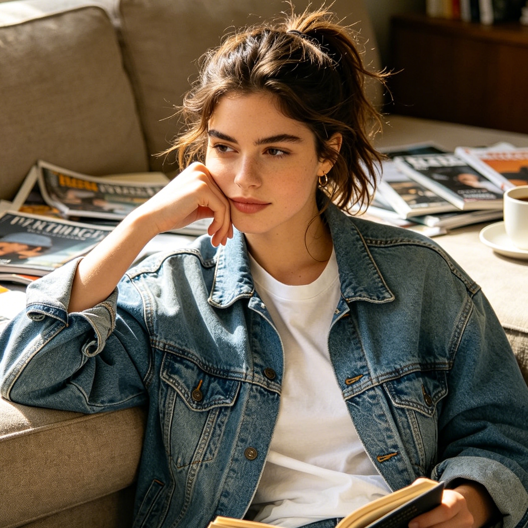
Contrast is the visual difference that makes objects distinguishable from one another and their background. In the digital world, managing contrast serves two vital purposes: enhancing accessibility for better readability and elevating the aesthetic quality of visual media. Whether a screen is difficult to read due to glare or a photograph appears flat and uninspiring, knowing how to manipulate contrast is a fundamental skill for any modern user.
Changing contrast involves adjusting the relationship between the brightest highlights and the darkest shadows. Increasing this gap creates a sharper, more dramatic look, while decreasing it results in a softer, more muted appearance. This guide provides comprehensive, step-by-step instructions for adjusting contrast across various operating systems, professional editing software, and mobile platforms.
Adjusting System Contrast for Better Visibility
System-wide contrast adjustments are primarily used to improve accessibility. For individuals with visual impairments or those working in challenging lighting conditions, increasing screen contrast can make text sharper and interface elements easier to identify.
How to Change Contrast on Windows 11 and 10
Windows provides robust features for contrast management, ranging from simple brightness adjustments to dedicated high-contrast themes designed for maximum readability.
-
Using Contrast Themes: Windows includes preset "Contrast Themes" (formerly High Contrast Mode) that change the entire UI color palette to use high-contrast combinations like white text on a black background.
- Open the Start Menu and select Settings.
- Navigate to Accessibility on the left sidebar.
- Select Contrast themes.
- Choose a theme from the dropdown menu, such as Aquatic, Desert, Dusk, or Night sky.
- Click Apply.
- Quick Shortcut: Press Left Alt + Left Shift + Print Screen to instantly toggle the last used contrast theme on or off.
-
Adjusting Color Filters: If a full theme is too jarring, color filters can help.
- Go to Settings > Accessibility > Color filters.
- Toggle the switch to On.
- Select Inverted or Grayscale Inverted to drastically change how contrast is rendered across all apps.
-
Calibrating Display Color: For a more nuanced adjustment of the actual display output:
- Type "Calibrate display color" in the Windows search bar.
- Follow the on-screen instructions to adjust the Gamma and Contrast settings of your monitor hardware through the software wizard.
How to Change Contrast on macOS
Apple’s macOS offers a sleek way to increase contrast without necessarily altering the entire aesthetic of the operating system.
-
Increase Contrast Setting:
- Click the Apple Menu and select System Settings (or System Preferences on older versions).
- Navigate to Accessibility in the sidebar.
- Select Display.
- Toggle the switch for Increase contrast. This adds borders to buttons and makes interface elements more pronounced.
- Use the Display contrast slider located on the same screen to manually fine-tune the intensity of the UI's tonal separation.
-
Reducing Transparency: Often, the "transparency" effect in macOS makes text harder to read against busy backgrounds. Toggling Reduce transparency (also in the Accessibility > Display menu) effectively increases the perceived contrast of active windows.
Adjusting Contrast on iPhone and iPad (iOS)
Mobile devices are often used outdoors where glare can wash out the screen. iOS provides specific tools to combat this.
-
Accessibility Overlays:
- Open Settings.
- Tap Accessibility and then Display & Text Size.
- Toggle Increase Contrast to make the colors of app icons and text stand out more vividly against backgrounds.
-
Reduce White Point: This is a unique contrast-related setting. If the bright whites are too intense, toggle Reduce White Point and use the slider to dull the intensity of bright colors. This preserves contrast while making the screen more comfortable for the eyes.
-
Smart Invert: Found in the same menu, Smart Invert reverses the colors of the display except for images and media, providing a high-contrast reading environment that doesn't ruin the look of your photos.
Adjusting Contrast on Android Devices
Android's implementation varies slightly by manufacturer, but the core accessibility features remain consistent.
-
High Contrast Text:
- Go to Settings > Accessibility.
- Look for Text and display or Vision enhancements.
- Toggle High contrast text. This adds a thin outline to text, making it pop regardless of the background color.
-
Color Inversion:
- In the Accessibility menu, select Color inversion. This is useful for reading white text on a black background across all apps, including those that do not support a native dark mode.
How to Change Contrast in Photo Editing
In photography, contrast is the tool used to guide the viewer’s eye. A flat photo lacks depth; a high-contrast photo commands attention. Adjusting it in post-production allows for creative control that a camera sensor might not capture automatically.
Professional Adjustments in Adobe Photoshop
Photoshop offers multiple ways to change contrast, each providing a different level of control.
-
Brightness/Contrast Slider (The Quick Fix):
- Go to Image > Adjustments > Brightness/Contrast.
- Moving the Contrast slider to the right expands the tonal range; moving it left compresses it.
- Tip: Always keep "Use Legacy" unchecked. The modern algorithm is designed to protect highlight and shadow detail from "clipping" (turning into pure white or pure black).
-
Levels (Balanced Control):
- Press Ctrl+L (Windows) or Cmd+L (Mac).
- The Levels histogram shows three sliders: Black Point, Midtones, and White Point.
- To increase contrast, drag the Black Point slider inward to the right and the White Point slider inward to the left. This forces the darkest pixels to be darker and the lightest to be lighter.
-
Curves (The Gold Standard):
- Press Ctrl+M or Cmd+M.
- The diagonal line represents the tonal range of the image.
- The S-Curve Technique: To create a professional, punchy look, click on the line in the upper third and drag it up slightly (brightening highlights). Then, click on the lower third and drag it down slightly (deepening shadows). This "S" shape increases contrast while maintaining a smooth transition in the midtones.
Adjusting Contrast in Adobe Lightroom
Lightroom is preferred for batch processing and non-destructive editing.
- Global Contrast: The Contrast slider in the Basic panel is the primary tool. However, it can be blunt.
- Tone Curve: Similar to Photoshop's Curves, Lightroom's Tone Curve allows you to target "Highlights," "Lights," "Darks," and "Shadows" individually.
- Texture and Clarity: These are "local contrast" tools. Clarity increases contrast in the midtones, making textures look sharper without affecting the overall brightness of the image as much as the standard contrast slider.
Editing Contrast on Mobile Apps (Instagram, Snapseed)
For quick social media edits, mobile sliders are surprisingly effective.
- Instagram: After selecting a photo, tap Edit > Contrast. Use the slider to add "punch." Typically, a value between +10 and +25 is sufficient for a vivid look.
- Snapseed: Use the Tune Image tool. Swipe up or down to select Contrast, then swipe right to increase. Snapseed also offers a Selective tool, allowing you to change the contrast of only a specific part of the image, like a dark face or a bright sky.
Advanced Contrast Control in Video Editing
Changing contrast in moving images requires a more technical approach to ensure consistency across frames.
Lumetri Color in Premiere Pro
Professional video editors use the Lumetri Color panel to manage "Style Modules."
- Linear vs. S-Curve: Standard contrast adjustments in video are often linear, stretching the signal. However, editors often apply an S-curve via the Curves tab to ensure that highlights "roll off" smoothly rather than hitting a hard digital ceiling.
- Pivot Points: In advanced modules, you can adjust the "Pivot." This determines the specific grey level around which the contrast expands. If your video is mostly dark, you might move the pivot point lower so that the shadows don't get crushed too quickly when you increase contrast.
- Waveform Monitors: When changing video contrast, professionals always watch the Luma Waveform. This graph shows the luminance levels of the image. The goal is to stretch the waveform so it fills the space between 0 (black) and 100 (white) without "flat-lining" at either end, which indicates a loss of data.
The Technical Principles of Contrast
To change contrast effectively, it helps to understand what is happening behind the pixels.
The Role of the Histogram
A histogram is a graphical representation of the tonal distribution in a digital image.
- High Contrast Histogram: Pixels are bunched up at the far left (shadows) and far right (highlights), with a valley in the middle.
- Low Contrast Histogram: Most pixels are concentrated in the center, forming a "mountain" in the midtones with empty space at the edges.
When you use a contrast slider, you are essentially stretching this graph toward the edges.
Dynamic Range and Clipping
Every camera and screen has a Dynamic Range—the limit of how much detail it can show in the shadows and highlights simultaneously.
- Clipping: This occurs when you increase contrast too much. The pixels hit the absolute limit of 0 or 255 (in 8-bit color). Once clipped, that detail is gone forever; a white cloud becomes a solid white blob, and a dark suit becomes a black silhouette.
- Experience Tip: When editing, always look for the "Clipping Warning" (usually a small triangle in the corner of the histogram). If it glows red or blue, you have pushed the contrast too far.
Tonal Range and Bit Depth
The "smoothness" of your contrast adjustment depends on bit depth.
- 8-bit images have 256 levels of brightness. Adjusting contrast heavily on an 8-bit file can lead to "banding," where you see visible stripes in the sky or shadows.
- 16-bit or RAW images have thousands of levels. This provides the "headroom" to change contrast drastically without losing image quality.
When to Increase vs. Decrease Contrast
Knowing how to change contrast is technical; knowing when is artistic.
Reasons to Increase Contrast
- To Add Drama: Landscapes and architectural photography benefit from high contrast to emphasize shapes and textures.
- To Improve Legibility: In documents or UI design, high contrast between text and background is essential for accessibility.
- To Fix Haze: Photos taken on foggy days or through glass often look "washed out." Increasing contrast "dehazes" the image.
Reasons to Decrease Contrast
- To Create a Vintage/Muted Look: Low contrast is popular in portrait and wedding photography to create a soft, romantic, or "film-like" aesthetic.
- To Retain Detail: If you are shooting a scene with very bright sun and very dark shadows, you may need to lower contrast in post-production to see the details in both areas.
- To Reduce Eye Strain: High-contrast screens can be exhausting to look at for 8 hours a day. Lowering contrast slightly can make a monitor easier on the eyes during long work sessions.
Quick Summary of Contrast Shortcuts
| Device/Software | Action | Shortcut / Path |
|---|---|---|
| Windows | Toggle High Contrast | Left Alt + Left Shift + Print Screen |
| macOS | Increase Contrast | System Settings > Accessibility > Display |
| Photoshop | Open Curves | Ctrl + M (Win) / Cmd + M (Mac) |
| Photoshop | Open Levels | Ctrl + L (Win) / Cmd + L (Mac) |
| iOS | Increase Contrast | Settings > Accessibility > Display & Text Size |
| Android | High Contrast Text | Settings > Accessibility > Text and display |
Frequently Asked Questions
What is the difference between Brightness and Contrast?
Brightness shifts the entire histogram. If you increase brightness, every pixel gets lighter—darks become grey, and whites become brighter. Contrast, however, expands or contracts the distance between them. Increasing contrast makes darks darker and lights lighter simultaneously.
Does increasing contrast affect image quality?
Yes, if done excessively. It can lead to "noise" in the shadows and "clipping" in the highlights. For the best results, always edit in a high-bit-depth format like RAW or TIFF rather than JPEG.
Why does my screen contrast keep changing automatically?
This is usually due to a feature called "Adaptive Brightness" or "Auto-Contrast." On Windows, this is often an Intel or AMD graphics setting designed to save power. On mobile, it’s usually the "Auto-Brightness" or "True Tone" (iOS) setting. You can disable these in your display settings if you want a consistent contrast level.
Is high contrast better for gaming?
Generally, yes. High contrast helps in spotting enemies in dark corners or distinguishing UI elements from the game environment. Most gaming monitors come with a "Black Equalizer" or "Shadow Boost" feature, which is essentially a localized contrast adjustment for dark areas.
Can I change contrast using the command line?
Yes, for developers or those batch-processing thousands of images, ImageMagick is the tool of choice.
Using the command: magick input.jpg -sigmoidal-contrast 5,50% output.jpg
This applies a non-linear contrast adjustment that protects midtones while enhancing the overall punch of the image.
Conclusion
Adjusting contrast is a powerful way to tailor your digital experience. From a practical standpoint, it ensures that your devices are accessible and comfortable to use, regardless of your vision or environment. From a creative standpoint, it is the engine that drives visual storytelling, allowing you to transform a flat, lifeless image into something vivid and professional. By mastering the tools in your operating system and the advanced features in editing software, you gain full control over how you see—and how the world sees your work.
-
Topic: Use color and contrast for accessibility in Microsoft 365 | Microsoft Supporthttps://support.microsoft.com/en-us/Accessibility/windows/use-color-and-contrast-for-accessibility-in-microsoft-365
-
Topic: Available Style moduleshttps://helpx-origin-ew1.aws116.adobeitc.com/nz/premiere/desktop/correct-color/color-mode-fundamentals/available-style-modules.html
-
Topic: Image Contrast: What It Is and How to Adjust Ithttps://pixotter.com/blog/image-contrast/